Logo Design is a creative process. Graphic design skill are not enough to create a good logo. What is needed is an eye to catch the inner essence of the branding for the logo design. An idea has to be generated on paper which is then worked further to create a harmony of various thoughts.
This tutorial shows each step of development which leads to final
design of the logo. The concept is created by gelling of various ideas
into a unified thought.
This is a logo design for a Music Company. The client was developing a
music website in New Zealand promoting royalty free music for Kiwi
listeners. He wanted us to stress the Royalty Free work in the logo
design. Moreover he wanted an NZ feel to the logo.
|
Table of Contents STEP-1 |
 |
|
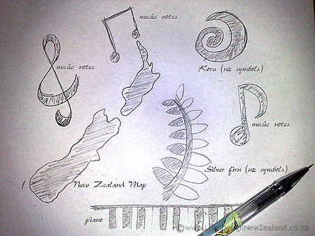
The first step of the logo designer was to sketch
ideas on paper. He drew as many symbols as I think of related to music and NZ identity. Musical notes, Koru, Silver fern, New Zealand map ,keyboards were drawn to generate further ideas. We wanted to integrate the music theme with NZ symbolism since the music was NZ listeners. Our aim was to produce a logo which intertwined music theme with Kiwi identity. |
STEP-2 |
 |
|
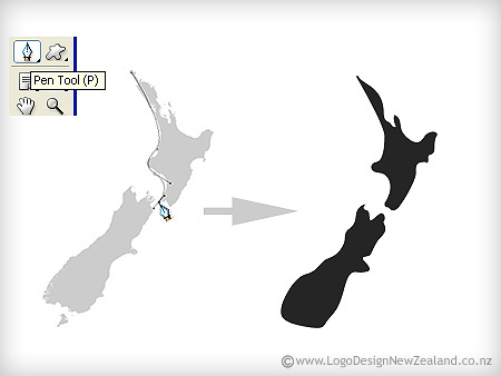
Silver Fern and Koru symbols were rejected as they
have been used numerous times in various logo. We decided to work on New Zealand map as it has an interesting form. The map was modified to make it more fluid and rhythmic so that we can integrate it with a musical idea at later stage. |
STEP-3 |
 |
|
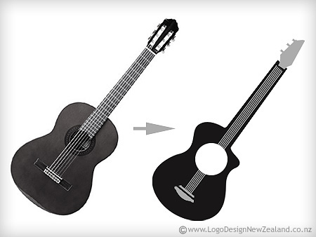
More than the musical notes and keyboard, guitar
was found to be more versatile in moulding into a format .For step 3 ,we decided to work on the guitar to give a stylish shape with a customised look.We wanted the form of the guitar to be flexible so that it could be integrated smoothly into the logo concept. |
STEP-4 |
|
Our 4th Step was to bring together the New Zealand
map and the guitar.We blended the map into guitar to create a unified whole.The north island par of the map fitted in with the neck of the guitar.There was need for some imaginative customization of the map but eventually it fitted in nicely giving a nice creative feel to the logo concept. |
STEP-5 |
|
Though the integration had been done for the NZ
map and guitar yet somehow it still needed some adjustments to make it more harmonious.So the bottom part of the south island was settled into the hollow of the guitar so that NZ map could be accomodated with guitar shape in a clean neat manner. |
STEP-6 |
|
Once the graphic has been designed , the fonts of
the logo were added. We used … font as it works very well for a musical logo as the letter match the musical notes. We adjusted the fonts around to get the best placement . |
STEP-7 |
| Once the logo was ready,colors were added.This is most important part as colors lift the logo to a grand style.Black was decided to be the background as it adds glamour to the logo design.Red and white enhanced the look and also created a contrast with black background.We have changed the placement of the font stressing on thewords Royalty Free in the logo design.
The major idea of this tutorial is trace the development of the idea in |